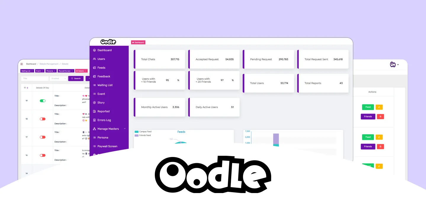
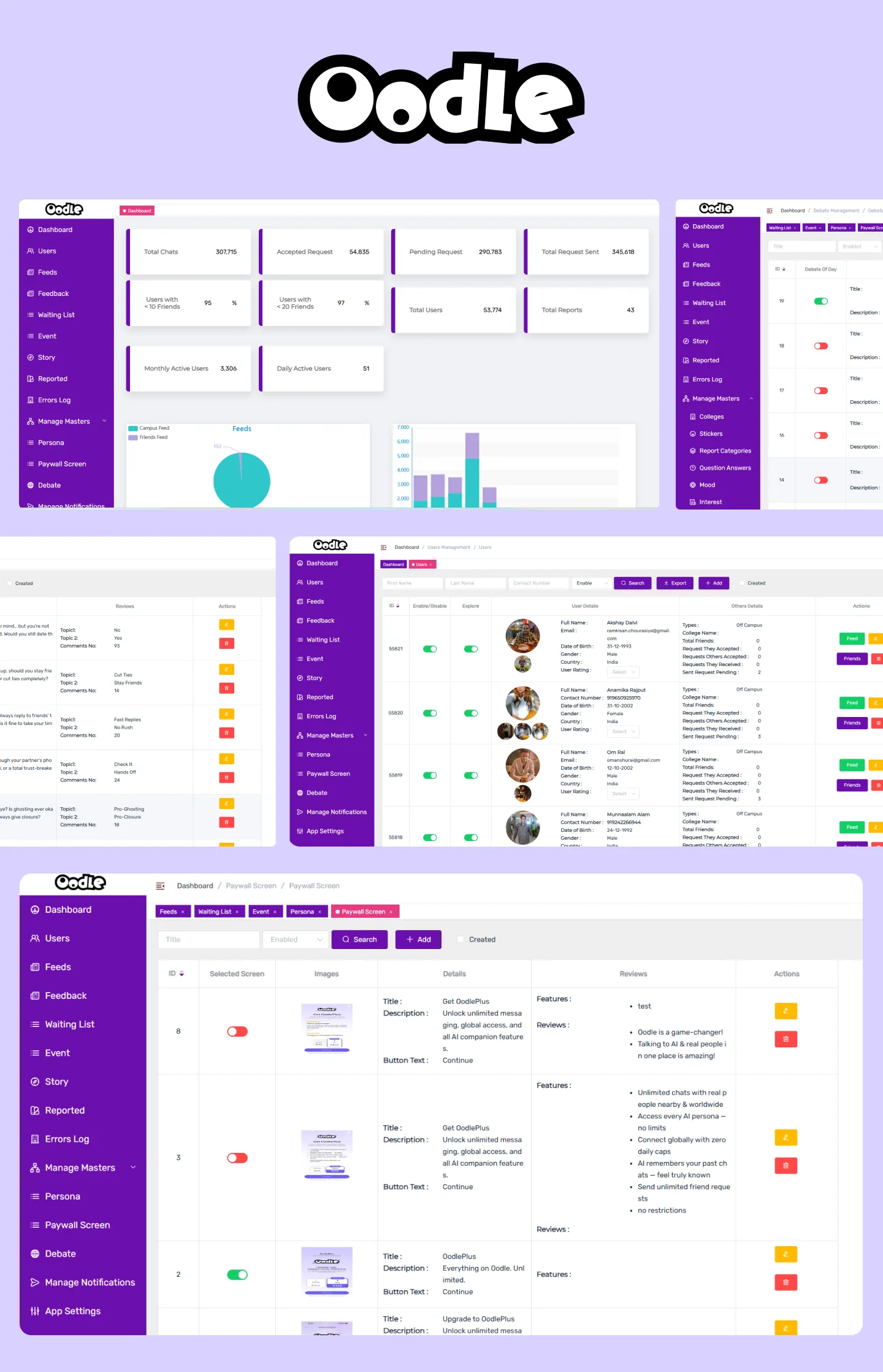
Oodle Dashboard Your Community Engagement Hub
Dashboard
User Engagement
Mobile UI/UX Design + Development
 India
India
The Oodle Dashboard provides a real-time pulse on community activity and growth. From vibrant chat exchanges and the flow of new connections to the responsiveness of user interactions, we offer a clear window into how your Oodle community is thriving and expanding.

Overview
The Oodle Dashboard offers a quick and clear view of your community's health. It highlights active chats and connection requests, giving you an understanding of user interaction.
Track daily and monthly active users alongside overall growth trends to monitor engagement. Understand how users are connecting.
By providing essential data on user activity and feedback, the Oodle Dashboard empowers you to keep your community vibrant and address any emerging needs effectively.
Challenges
Simplifying complex community data for clear and actionable administrative insights.
Ensuring real-time data accuracy and intuitive presentation for effective monitoring.
Creating a customizable yet comprehensive dashboard experience for diverse administrator needs.
Our Approach
Our approach to the Oodle Dashboard centers on providing community administrators with an intuitive and insightful platform. We aim to make understanding and managing your community's dynamics a seamless and efficient experience.

Centralized Insights
Centralizing key community metrics and activities in one interface simplifies data analysis for a complete view of engagement and growth.

Clear Visualizations
Easy-to-understand charts and graphs transform complex data, enabling quick identification of trends and community performance insights.

Actionable Information
Providing context and highlighting key trends beyond data presentation empowers proactive decisions for a thriving community environment.
Ideation: Empowering Effective Community Management
The Oodle Dashboard's core idea is to empower administrators with an intuitive platform for understanding and managing their online community. By seamlessly tracking key metrics and providing actionable insights, it enables more informed decisions and fosters a thriving environment.
Effortless Community Overview
Real-time monitoring of key engagement metrics.
Simplified view of user growth and activity.
Easy access to overall community size and trends.
Seamless Insights & Management Overview
Quick access to key performance indicators over time.
Easy overview of overall user activity and interaction.
Clear view of user feedback and community sentiment.
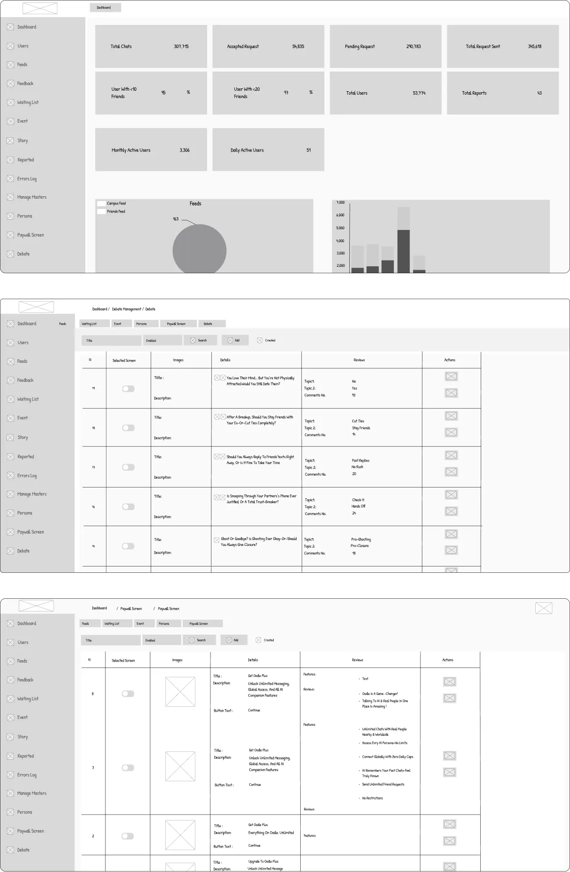
Wireframes: Visualizing the User Journey
Designing: Crafting a Seamless User Experience
Our design process focused on creating an intuitive and efficient interface. We prioritized user needs and streamlined workflows for optimal functionality.
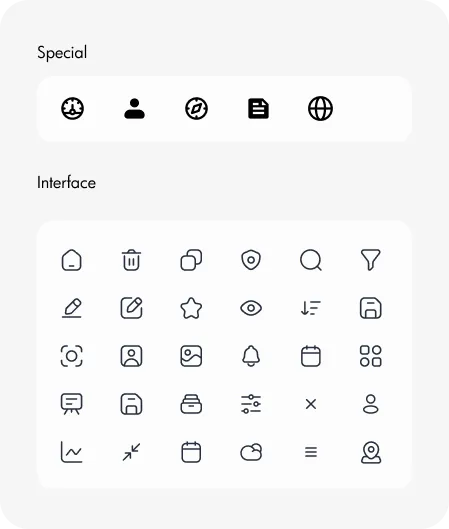
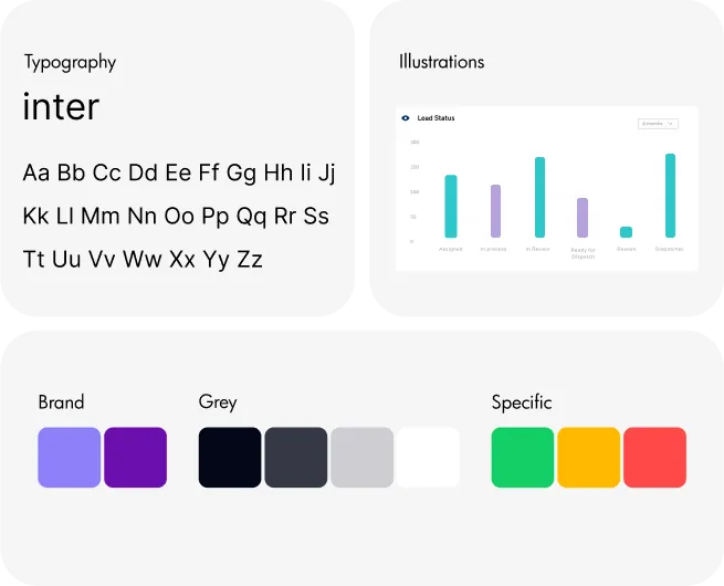
Style Guidelines
Final UI Screens: Polished and Functional
Future Goals: Enhancing Community Management
The Oodle Dashboard will continuously improve, innovating to deliver a more comprehensive and user-friendly platform with insightful tools for effective community management and thriving online spaces.
Connecting with more relevant platforms and tools will offer administrators a broader understanding of community activity and overall health.
We plan to create enhanced tracking and analytics, providing administrators with insights into user behavior and content performance.
Exploring insights and recommendations will help administrators identify issues and improve community engagement and growth.