18 Dec 2025 • Vivian Butwani
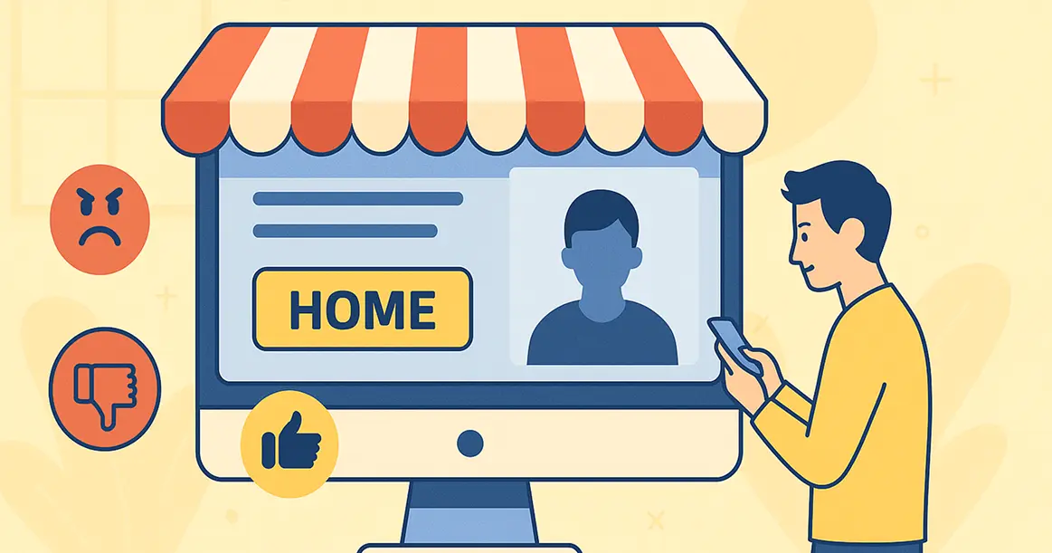
Your website homepage is your digital storefront. When people visit, they decide almost instantly if they want to stay or go. This first impression is crucial. If your homepage is confusing or slow, you lose customers. If it is clear and helpful, you make sales.
You don't lose sales because your product is bad. You lose sales because your homepage pushes people away. Let's look at why these first few moments matter so much and exactly how you can make them count.
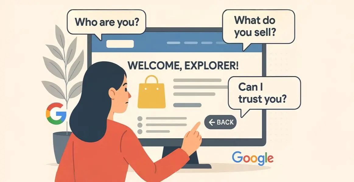
When a person lands on your homepage, their brain works fast. They look for answers to three simple questions: Who are you? What do you sell? Can I trust you?
They don't read every word. Instead, they scan for pictures, headlines, and buttons. If they can't answer those questions instantly, they get frustrated and hit the back button. This "bouncing" kills your immediate sales and damages your long-term SEO rankings with Google.
Your main headline is the most important text on the page. It must be big, bold, and crystal clear. Do not use fancy words or clever jokes. Just say exactly what you do.
Avoid vague phrases like "Empowering Digital Synergies." Instead, use direct language like "We Build Websites That Sell." This tells the visitor exactly what they get. Your sub-headlines act as signposts, guiding the reader down the page to the information they need.
To make your headlines work, you need to know where people look. Scientists have tracked how human eyes move across a website using "heatmaps." They found a consistent pattern that looks like the letter "F."
This makes the left side of your screen "prime real estate." Put your most important value proposition here. If you hide key information in the bottom right corner, most people will never see it during their initial scan."
We all hate waiting. Studies show that even a one-second delay can lose you sales. Your homepage needs to load almost instantly.
Big files often slow things down. You must ensure your content is compressed. Using modern image formats like WebP instead of heavy JPEGs makes a huge difference. You also need reliable hosting, as cheap servers often struggle to handle traffic.
Don't guess. Use free tools like Google PageSpeed Insights or GTmetrix to check your speed. They give you a specific score and a checklist of files to fix.
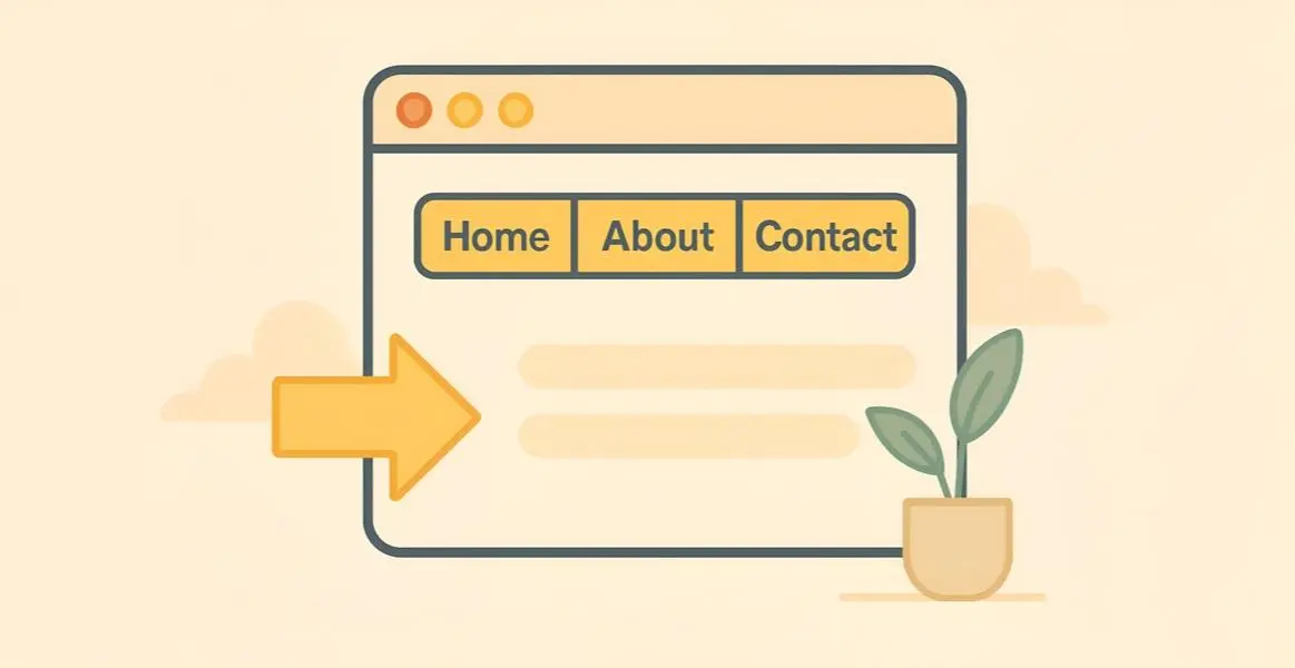
Your website navigation needs to be organized and predictable. Put your menu where people expect it—usually at the top. Use standard labels like "Home," "About," and "Contact."
Don't clutter your menu. Too many options cause "decision paralysis," where users worry about picking the wrong link and choose nothing."
Follow the "3-Click Rule." A user should be able to find any important piece of information on your site within three clicks. If they have to dig deeper, they will likely give up.
You have their attention. Now, what should they do? This is the job of the Call to Action (CTA).
Common examples are "Buy Now" or "Get a Quote." Your CTA button must stand out. Use a contrasting color and big text. Don't be shy. If you want them to buy, show the "Add to Cart" button clearly. Place one CTA "above the fold" (visible without scrolling) and another at the bottom. A strong CTA guides the user directly to the sale."
Buying online requires trust. Your homepage needs to prove you aren’t a scam using “trust signals.”
These elements prove you are a legitimate, reachable company.
Today, more people browse on phones than on desktop computers. Your homepage must be "mobile responsive."
If text is too small or buttons are too close together on a phone, users will leave. You also need to think about the "Thumb Zone." This is the area on a phone screen that a user can easily reach with their thumb while holding the device. Important buttons should be in this easy-to-reach zone.
'Test your site on your own phone. Google indexes the mobile version of your site first; if it's bad, your rankings will disappear.'
A messy website is stressful. Good UX requires a clean, open layout.
Limit your color palette to two or three complementary colors. Use plenty of "white space" (empty space) between elements. This gives the eyes a rest and highlights your important content. A clean layout tells the user that you are professional and organized.
Before you finish, take a moment to test your own website. Open your homepage and blink your eyes. Ask yourself these questions:
If you answered “No” to any of these, you have work to do. But small changes make a big difference.
The first impression on your homepage is a test you must pass to make a sale. By being clear, fast, and helpful, you can win customers quickly.
Answer their questions, use strong headlines, ensure mobile speed, and guide them with a bold CTA. Do this, and you will turn casual visitors into loyal buyers.
You should look at data in tools like Google Analytics. The most important metric to check is your "bounce rate." A high bounce rate means people are landing on your page and leaving immediately. You should also look at "session duration" to see how long they stay.